


Apple Logo
We take a look here at the origins and history of the logos and branding of Apple. Apple is now one of the most successful companies in the world, with awesome consumer products such as Apple Music, Apple TV, the iPhone, the iPad, the Apple Watch, the MacBook, the iMac and the Mac Pro.
Back in the 80’s I had an Apple II as my home PC, using it for games, word-processing and a little coding. In 1988 I used my first Apple Mac, a Mac Plus with a 20mb hard drive and an external A4 monitor, for the new fad of desktop publishing. In the 90’s I consulted on and sold Mac systems for creative companies across the UK, even building my first website in 1995 with a Mac IIci.
As well as producing some of the most sought-after consumer electronic devices on the planet, Apple is famous for it’s industry-standard professional graphic design and creative computers. Macs have been essential tools for any serious creative agency since the late 1980’s and continue to lead the way.
The First Apple Logo – 1976-1977

Apple’s Newton Inspired Logo
Back in 1976 in California Steve Jobs and Steve Wozniak were working on the original Apple I computers and selling them as home PC kits to local computer club members and electronics stores.
The designer of the first Apple was Ronald Wayne, a colleague of Jobs and Wozniak and sometimes referred to as the ‘third founder’.
Ronald prepared the trio’s first partnership agreement but relinquished his 10% stake in Apple Computer Co. for just $800 12 days later. Apparently, he wanted to avoid potential financial risk, as he had assets that could have been seized by creditors had the fledgling company gone under.
This first ever image to represent the company featured Sir Isaac Newton, the man who inspired science with his theory of gravity. Allegedly an apple fell from a tree and the rest is history. The words APPLE COMPUTER CO. were drawn on a ribbon banner ornamenting the picture frame.
The logo also included a quote from Wordsworth – “Newton… a mind forever voyaging through strange seas of thought.”
We know that Steve Jobs had a passion for typography and fonts. The logo was hand drawn and thus did not use an established font. However, the typeface of the company name ribboned top and bottom is similar to Caslon, with some idiosyncratic details, such as an R deviating from the general style.
The first logo did not last very long. Steve Jobs began to explore something new for the logo, something different. He believed that the original was too old fashioned and he considered it difficult to be used to reproduce an image small enough to be used for branding a computer.
The Apple ‘Rainbow’ Logo – 1977-1998
 Incredibly, the first ‘Apple’ logo, first created in 1977, still survives to this day – albeit in a slightly different monochromatic form. Jobs sought the help of designer Rob Janoff who took just 2 weeks to develop the icon we know today of the ‘bitten apple’.
When asked about the design process, Janoff stated “It was very simple really. I just bought a bunch of apples, put them in a bowl, and drew them for a week or so to simplify the shape.”
The logo became simply an ‘Apple’, with a bite taken out of it. According to Janoff, the “bite” in the Apple logo was originally implemented so that people would know that it represented an apple, and not a cherry tomato. It also lent itself to a nerdy play on words (bite/byte), a fitting reference for a tech company.
Apparently there was no particular reason for the positioned of the coloured stripes, other than that Steve Jobs had requested green to be at the top “because that’s where the leaf was”.
The use of colours in the logo was representative of the soon-to-be launch of the Apple II Computer, the first home PC capable of colour graphics.
For the next 20 years the Rainbow Logo adorned Apple’s products from the Apple II through to the original Power Mac range.
Motter Tektura Typeface
Before the introduction of the first Macintosh, alongside the Apple logo, Apple used a typeface called Motter Tektura, which was designed in Austria by Othmar Motter of Vorarlberger Graphik in 1975 and distributed by Letraset (and also famously used by Reebok). At the time, the typeface was considered new and modern.

Apple Logo Motter Tektura 1977
According to the logo designer, Rob Janoff, the typeface was selected for its playful qualities and techno look, which were in line with Apple’s mission statement of making high technology accessible to anyone. Janoff designed the logo in 1977 while working with Palo Alto marketer Regis McKenna.
Apple Garamond Typeface

Apple Logo Think Different
Since the introduction of the Macintosh in 1984, Apple adopted a new corporate font called Apple Garamond. It was a variation of the classic Garamond typeface, both narrower and having a taller x-height. Specifically, ITC Garamond (created by Tony Stan in 1977) was condensed to 80% of its normal width. Bitstream condensed the font, subtly adjusted the stroke widths, and performed the hinting required to create the font, which was delivered to Apple as the Postscript font “apgaram”.
In cases where the Apple logo was accompanied by text, it was always set in Apple Garamond. Aside from the company name, most of Apple’s advertising and marketing slogans, such as “Think different.”, used the font as well.
The typeface was virtually synonymous with Apple for almost two decades and formed a large part of the company’s brand recognition. It was used not only in conjunction with the logo, but also in manuals and ads and to label products with model names.
Apple has not released the true Apple Garamond font. ITC briefly sold ITC Garamond Narrow—Apple Garamond without the custom hinting—as part of its Apple Font Pack in the 1990s. A version of the font was also included under a different name in some versions of Mac OS X prior to 10.3 as it was used by the Setup Assistant installation program.
Early 1980’s – Slight Reworkings
A branding firm in San Francisco were commissioned to rework the logo slightly in the 1980’s, making the shape more symmetrical and geometric. Landor & Associates had the advantage then of using Apple Macs with Adobe Illustrator software, tools that the original designer, Janoff did not have in 1977.

Gill Sans Typeface
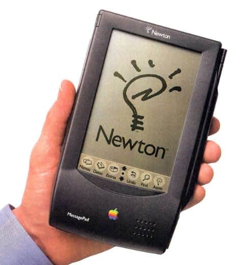 In the marketing of the Newton/Notepad/MessagePad PDA (starting in 1992), Apple used Gill Sans instead of the regular Apple Garamond. Gill Sans Regular was used in the logo, for the model name on the computer, on the keyboard and in advertisement materials, though it was not used as a screen font (except as part of the Newton logo).
The Apple Monochrome Logo – 1997 onwards
 When Steve Jobs returned to Apple in 1977 the company was in serious decline. According to Jobs, at one point they were 90 days away from running out of money.
For the launch of the original iMac – the ‘Bondi Blue’ in 1998 the colours were removed from the Rainbow Logo as they did not fit the revolutionary new all-in-one computer’s styling. Instead, the ‘bitten Apple’ was co-ordinated with the Bondi’s striking colour scheme.
[simple-author-box]
Frequently Asked Questions
Who designed the Apple Logo?
The current logo, an apple with a bite taken out of it, can be traced back to 1977 and was designed by Rob Janoff.
Why is the Apple Logo bitten?
According to Janoff, the “bite” in the Apple logo was originally implemented so that people would know that it represented an apple, and not a cherry tomato. It also lent itself to a nerdy play on words (bite/byte), a fitting reference for a tech company.
What does the Apple Logo mean?
Former Apple executive Jean Louis Gassée called the logo “the symbol of lust and knowledge.” There are many theories, including Biblical references to the Garden of Eden, a salute to Sir Isaac Newton, and more.
Why is Apple called ‘Apple’?
There are many myths but we do know that Steve jobs once worked in apple orchards in Oregon. Steve Wozniak describes the naming process as a simple one and that “anything that sounded interesting was valid”.


Great article, we love anything Apple related here at Banner World. We currently have iMac Pro’s, MacBook Pro’s and iPad Pro’s here at the office, along with iPhones of course.